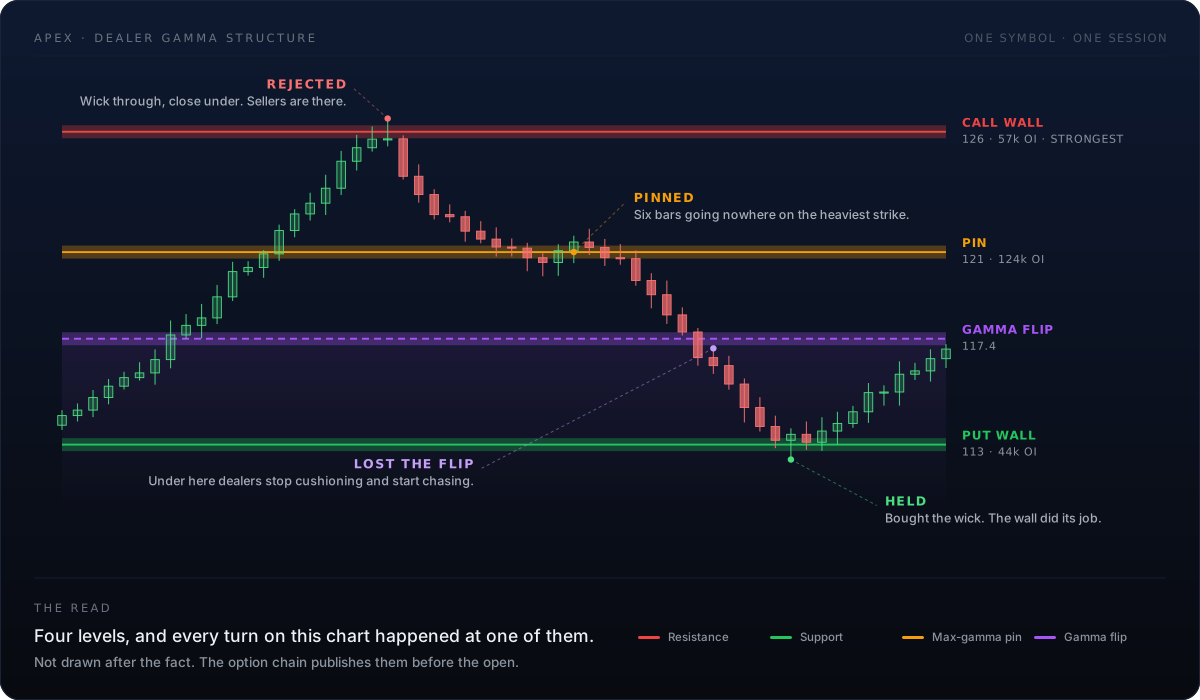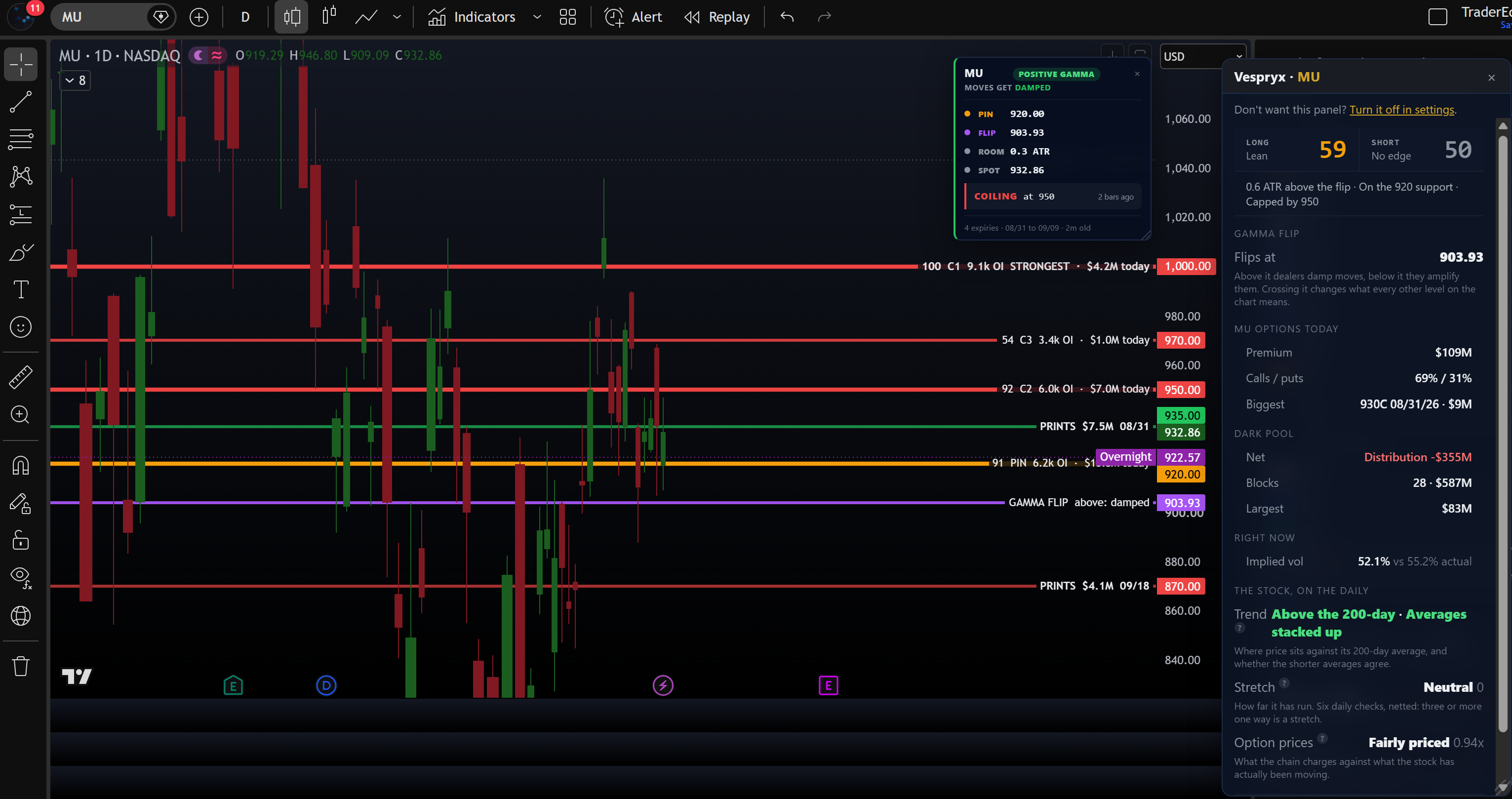
Size alone is not a wall. Vespryx scores every strike on how much dealer hedging actually sits there and draws the ones that change price behaviour — with the open interest written on the line so you can judge it yourself.
Above the gamma flip, dealers sell strength and buy weakness: dips get bought, ranges hold. Below it, the same hedging accelerates the move instead. Same chart, opposite rules — and nothing on a stock chart tells you which side you are on.
Levels only mean something in context. When trend and dealer positioning disagree, Vespryx says so out loud instead of leaving you to talk yourself into the bounce.
No build step. No API key. No config file. The extension reads your own logged-in session and gets to work on the chart already open in front of you.
Download the folder and drop it into Chrome, Edge, Brave, Opera or Arc. About a minute, and nothing to compile.
The extension picks up your Vespryx session by itself. Nothing to paste, and never an API key.
The structure draws itself and repaints when you switch symbol. A status pill says what it is doing, so a blank chart is never a mystery.
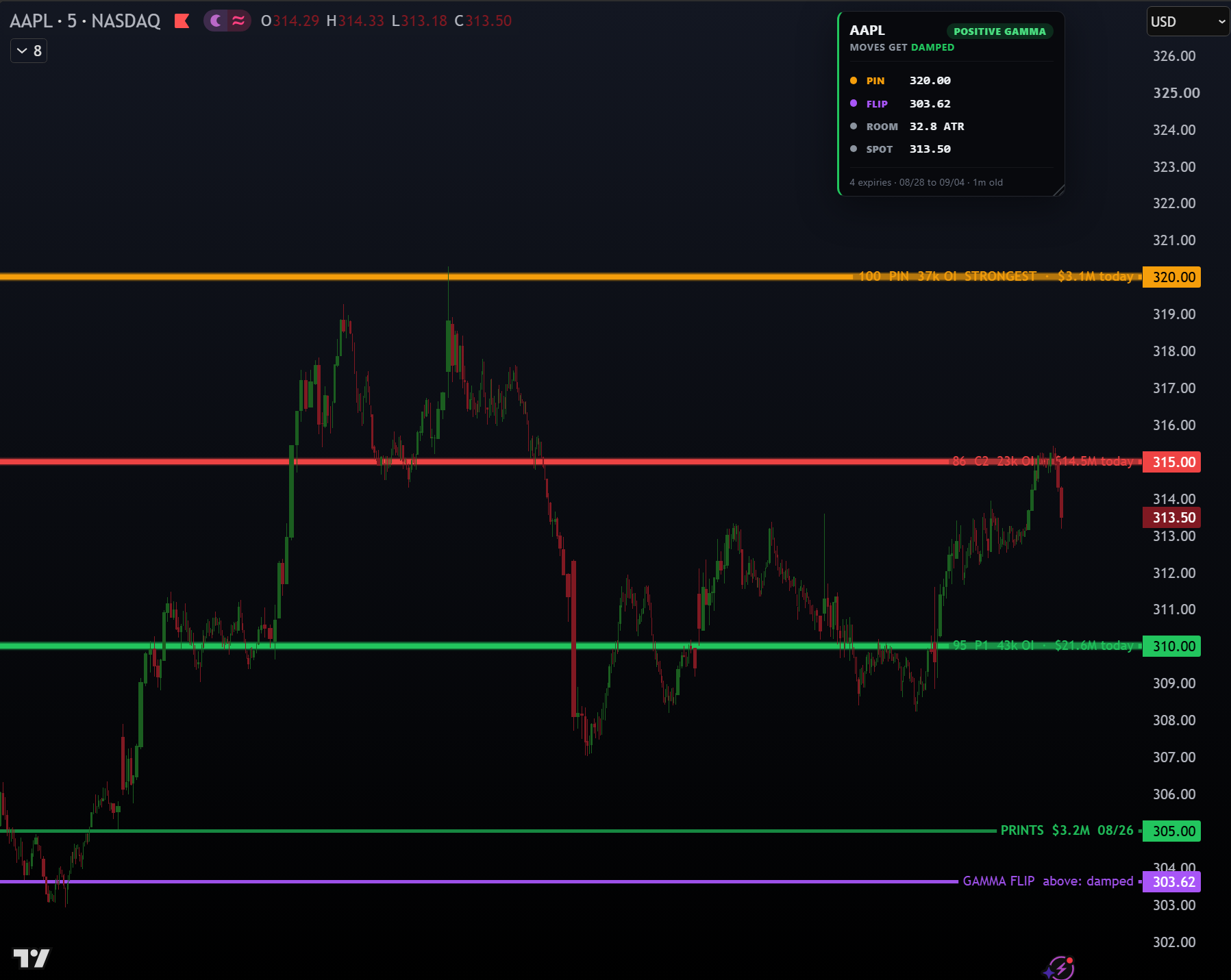
Red is where price is likely to stall. Green is where it is likely to hold. Amber is the magnet it drifts to and sticks. Purple is where dealers stop cushioning it. Every level carries its open interest, and the strength of each line scales with how much hedging actually sits there — so a 34k wall never looks like a 107k one.
Not a legend. A read. “Moves get damped — dips bought, rips sold, ranges hold. Breakouts stall and fade back.” The panel border is the regime at a glance: green when dealers are damping moves, red when they are amplifying them. You always know which set of rules is running.

Three states, and the third one matters: with no gamma flip in the chain there is no regime to call, so it says so instead of defaulting to positive.
{{ regimeBody }}
It reads the chart — dealer positioning, volume, momentum, trend — and commits to a single sentence, with the four inputs listed underneath so you can disagree with it. It says DO NOTHING HERE whenever trend and dealers disagree, which is often, and is the entire point.
Net gamma exposure in every cell, one call per expiry. The aggregate hides the flip that only one expiry can see; this does not.
Golden sweeps and blocks with premium, multiple of open interest, fill speed and side — flagged DIVERGENT when the obvious read is the wrong one.
On 12 sites — X, Reddit, StockTwits, Substack, CNBC, Benzinga and the rest — a mention turns into a badge with a flow popover. Check the claim without leaving the thread.
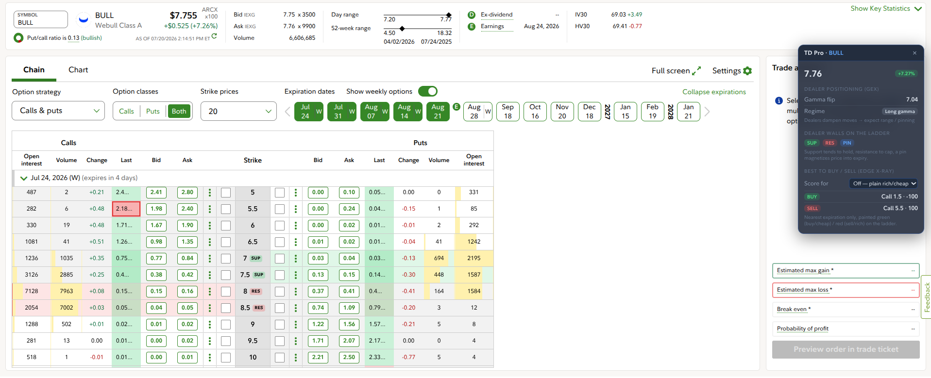
Open your option chain on Fidelity and the dealer levels are already there, with rich-versus-cheap scoring per strike. The read on the chart and the read at the order ticket are the same read — because they come from the same numbers.
The same facts render twice: as a text box drawn into the chart itself (so it syncs to your phone), and as a card inside the extension where each level can carry its own colour. Both are built from one source, so they can never state different numbers.
A chart text box gets one colour and one font size, so the panel names its levels in words — AMBER, PURPLE — and keeps lines short enough to survive a screenshot crop.
Chain age is stated and never judged: after the close an eighteen-hour-old chain is legitimate, so there is no fake STALE warning to learn to ignore.
Where the walls describe what dealers have done, the Companion HUD grades the price action on whatever chart and timeframe you are on — trend quality, momentum, money flow, squeeze state, exhaustion, volatility premium, and the position size that fits your risk budget.
It is 100% chart math: no API key, no external data, nothing to license. It ships as a plain script you paste once and keep, and it uses the same palette as the walls so the two read as one system.
Straight answer: mobile browsers and the TradingView app cannot run browser extensions, so Vespryx does not pretend to install there. The phone is a viewer, and it turns out that is enough — because everything Vespryx draws is saved into the chart layout, and your layout already syncs to every device you own.
Paint on the desktop, open the same layout on your phone, and the walls, the open-interest labels, the flip line and the regime panel are all there. The panel is kept deliberately narrow and pinned top right for exactly this reason: on a phone the chart is all you have, and a screenshot of it is often the whole conversation.
Vespryx arms alerts on the levels that actually change behaviour — the pin, the flip, and the nearest wall each side — as native chart alerts, so they reach your phone as push notifications without anything of ours running there.
A flip cross means the rules just inverted. A wall break means the level you were trading against is gone. Those are worth waking up for; the other four hundred prints stay in the feed.
We went back over the levels this scoring draws and counted what price actually did at them: stalled, held, or went straight through. Aggregate figures rather than a per-level track record, so you can weigh a line instead of taking it on faith.
You can already buy a page of gamma numbers. Then you read a strike off it, switch tabs, squint at the axis, and draw a line by hand — for every symbol, every morning, at the exact moment you should be watching price.
{{ item.body }}
One command dresses a whole watchlist and hands back a ranked report — sorted by how close price sits to a level that changes its behaviour, with the disagreements between models called out rather than smoothed over. Your phone finds the charts ready.
A coding agent can drive the same chart: read your bars, compute real trendlines and a regression channel from actual pivots, draw them, set alerts. It refuses rather than inventing a line when nothing qualifies.
You are about to let something draw on the screen you make money on. Here is exactly what that means, in the plainest terms we can write it.
Install it, keep it. The structure draws without a plan.
{{ priceNote }}
“{{ item.text }}”
I kept losing money at prices that meant something to somebody else. The bounce that “had to hold” was a strike where dealers were finished buying. The breakout that failed twice failed at a wall I could have drawn that morning, if I had known it was there.
So Vespryx does the boring part: pull the chain, score the strikes, draw the lines, and say what they mean in a sentence a tired person can read. It is deliberately unexciting. It tells you to do nothing more often than anything else — and that is the feature I paid the most for.
Still stuck? The docs cover the chart in detail, and there is a Discord where people argue about levels.
Join the Discord
Options dealer structure, drawn on the charts you already trade from.
Options involve substantial risk and are not suitable for every investor. Vespryx is a data-visualisation tool, not a broker, adviser or signal service: it describes what the option chain implies about a chart and does not recommend that you buy or sell anything. Dealer positioning changes intraday, levels move as the chain moves, and past behaviour at a level does not predict future behaviour. You are responsible for your own trades.